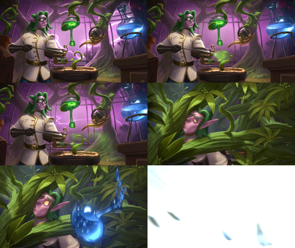
One of my favorite parts of every new Hearthstone expansion is the awesome artwork that is created for it! Blizzard has given us a look behind the scenes on what went on when creating the great art that was attached to The Boomsday Project!
Greetings! I’m Hadidjah Chamberlin, Senior Effects Artist on the Hearthstone team.
One of my favorite parts of working on Hearthstone is creating visual effects! From a game design perspective, the main role of visual effects (VFX) is to communicate information to the player in fun and interesting ways.
Visual effects help the player read the board and understand what’s happening more clearly. We also use our visual effects to reinforce the Hearthstone’s vibe and character—these effects can create suspense when you’re hoping for that Knife Juggler’s knife to land just right, make opening a pack that much more fun, or help celebrate big moments like pulling off an insane combo or finally clearing the latest single-player challenge.
In The Boomsday Project, we created a megaton of explosive, SCIENCE-filled visual effects—here are a few of my favorites!
Maintaining Class Identity
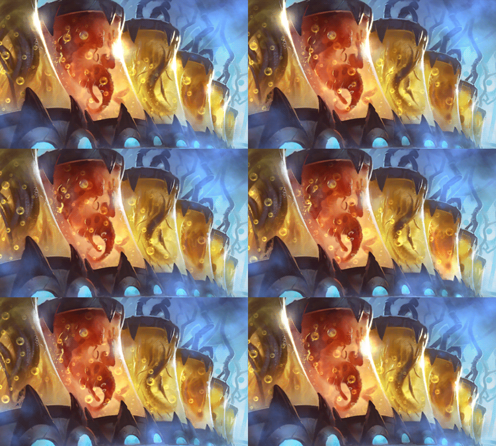
When you’re playing a Class in Hearthstone, we want you to really feel its identity. A lot of Class identity is defined through visual effects and the colors, materials, and shapes common to that Class. Take Priest, for example—it’s magical, ephemeral . . . light and pure. But when it comes to expansions like The Boomsday Project, we introduce some curveballs, like, “What if it was also full of slime?” How do we “slime-ify” the Priest while staying true to its Class identity?
Each Class (and Type, such as murlocs or pirates) have a few very specific color palettes that we use to help reinforce their identity. For Master Cloner Zerek and Zerek’s Cloning Gallery, all this cloning goo takes on that same light gold palette that most Priest effects have, and we tried to mix in as many light, magical elements as we could to help keep it feeling familiar and Priestly. I cheated it a little bit by using Zerek’s Ethereal nature as an excuse to put extra magic on him, to balance out his Cloning Gallery being REALLY slimy.
Making Priests slimy was a challenge, but the crossover of the astronomy flavor from Druid to Mage was trickier. We wound up focusing a lot on those Class differences in shape and palettes to differentiate them—I think of the Druid’s space magic as more moon-focused (spells like Starfall, Starfire, and Astral Communion have a cool, lunar palette with bigger shapes). Mage space magic evokes things like galaxies and nebulae, and uses smaller, sparkly star shapes that call back to arcane visuals.
Gloop—Glorious Gloop!
When I’m designing card effects, gameplay always comes first, but I also try to bring something new that hasn’t been done in previous sets. Overall, we tend to approach effects for certain card types in similar ways. For “rest of your turn” effects, such as Embrace the Darkness and Stampede, we tend to use full-screen vignettes to communicate that the effect is persistent. While those can look cool, they can also feel “heavy”. With Floop’s Glorious Gloop, we wanted to try a lighter approach so players could focus on playing out their combos and still get all the feedback they needed from the effects.
Because we weren’t going to do something on the board, the Hero was the most logical place to start. For this card we wanted a persistent, noticeable effect (and a cool sound effect) on the Hero that could run for the entire turn without getting annoying and without pulling too much attention from what you are doing.
Though it may sound like we have everything down to a science, there really isn’t a formula for how we balance visuals for something like this. From the start, we know which events are part of a card’s combo (for Floop’s Glorious Gloop, minions dying and mana crystals being restored), and we use those—along with things like the card’s story, and what we in the scientific community refer to as its “Big Dealness”— as our guidelines for how to design its effects.
Arise, Mecha’Thun!
Some of my favorite effects in Hearthstone are those we create for “Big Deal” cards—like Mecha’Thun! There are three different sorts of “big moments” we tend to use for effects.
- The first is for cards with huge mechanical implications, like King Togwaggle swapping decks, Meteor making minions extinct, or Mecha’Thun ending the whole freaking game.
- The second is for celebratory moments, like pulling off V-07-TR-0N’s assembly, dropping Azari, the Devourer to roast your opponent’s deck, or managing to pull off a successful Mecha’Thun turn.
- • The third is for the “You’re probably not doing much else this turn anyway” kind of effects, like Twisting Nether obliterating the board, Deathwing obliterating the board and your hand, and Mecha’Thun obliterating everything (Mecha’thun is a multi-talented fellow).
The goal of these Big Deal effects is to celebrate the moment and the player’s accomplishment in a unique way—Mecha’Thun really shouldn’t feel like V-07-TR-0N or Deathwing, because they all deserve to feel beautiful and special, and this is their night, Karen! So, my thought process when designing these isn’t just, “How do I make this awesome?” but also, “How do I make this awesome in a way that specifically feels connected to this card and event?”
For Mecha’Thun, that was the idea of this giant, ominous mechanical failure that spreads throughout the board until it takes your opponent down with it. It’s an awesome payoff, especially in contrast with his entrance visual effects.
Making Mechs Magnetic
One of the most interesting new mechanics in The Boomsday Project is Magnetic.
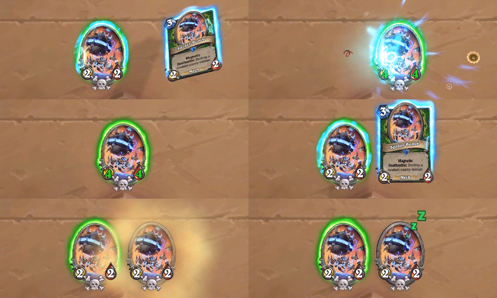
There were a lot of little pieces to Magnetic’s implementation, so the effects had to communicate a lot of different things: the valid targets, where to drag the minion to attach it (or not), when something was going to attach, and to what. On top of that, we also had to support the overall Magnetic fantasy, but make sure that the effect wasn’t too flashy (which could imply that the Magnetized option is always the better or “correct” option). Keeping all of that balanced and clear for players was a real challenge.
The initial UI mock-up was much more streamlined than the final FX—the beam wasn’t there, and instead we were using attach-point arrows with just a few sparks. We realized we needed much bigger, simpler shapes, so we gradually ditched all the little UI elements like the arrows in favor of a more direct and “magical”-seeming connection—at first with just concentrated regions of sparks, and then finally with the beam.
The whole process was collaborative—the UI team and I were bouncing around new ideas and giving each other feedback constantly, and early on, every playtest brought some pretty some big changes . . . the design team probably never wants to see another feedback request from me again.
The Hammer Dance
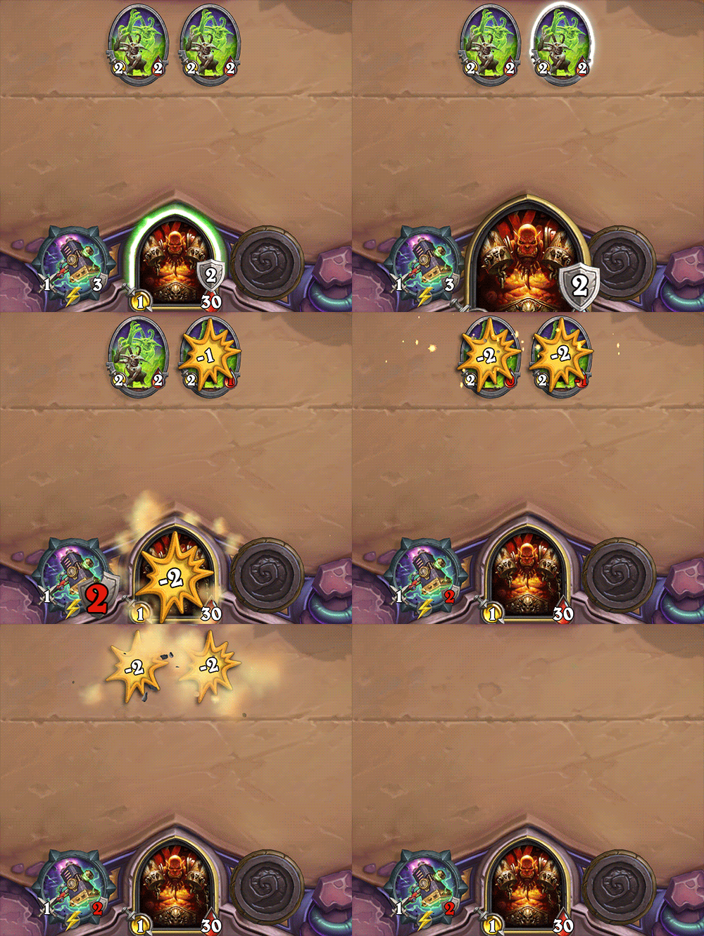
Sometimes in the development process, unexpected changes from other teams can throw a wrench into your plans. SuperCollider is one notable example. Originally, SuperCollider had no effects at all—the whole story was planned to be an engineering change that would just bounce the Hero into a minion, into another minion, kind of like a pinball. However, once our engineers started looking into altering that sequence, it turned out to be a whole can of worms full of Bad Things™.
We generally like to try and avoid Bad Things™, and that meant we had to re-visualize the fantasy of SuperCollider to play out over different timing than we’d planned. In the end, SuperCollider still slapped minions into each other with a giant hammer; it just became a lot more literal.
Once it became an effects task instead, SuperCollider also turned out to be pretty goofy animation-wise. Since we couldn’t really change the timing of anything, we had to sync to all the pieces that were already baked in—which might seem straightforward, but it created a lot of little challenges in making everything feel responsive and fun.
Most visual effects are also driven almost entirely client-side—they happen in the game, and the server doesn’t reeeeally care as long as it can send numbers on the damage or healing that’s happening. SuperCollider, on the other hand, was a pretty even split between pulling server-side and client-side information strictly for the visuals. So every time you swing SuperCollider, that poor lil’ hammer is running around, asking questions of both client and server while the animation is playing out, to make sure everything happens the way it’s supposed to.
These extra-weird effects that can be found in pretty much every set (lookin’ at you, Azalina and Crushing Walls), and they’re always really fun to puzzle out.
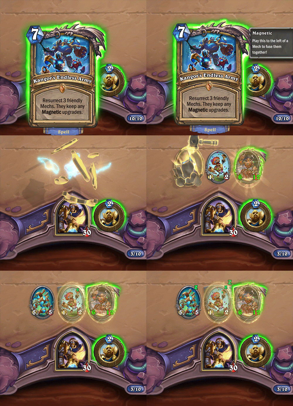
Animating an Endless Army
The Boomsday Project was a really fun expansion to create effects and animations for, but I had a blast working on Kangor’s Endless Army. I love keyframed animations where particle effects play a supporting role, so getting to do three different build animations with all the little details and secondary actions was super cool. And our audio team, as always, made it so much better.
I mentioned the importance of maintaining Class identity before, but Legendary minions get a lot more wiggle room because they’re more character-driven and unique. Rather than starting from the Class a Legendary is in, we tend to take cues from the card’s art and lore, then mix in as much of the Class flavor as we feel is appropriate (unless it’s Neutral, then all bets are off and you get Whizbang).
Legendary spells are in a fun sort of middle ground. They’re not strictly story-focused, in the way a Legendary minion’s entrance is, but ideally, they feel just as Legendary, while still being very mechanics-focused.
Thanks for reading along while Hadidjah regaled us with animation adventures! Do you have any favorite card effects from The Boomsday Project? Let us know in the comments!

